How to Fix 'maximum-scale Attribute Error'
To improve mobile accessibility, a core SEO element, we guide you on how to fix the 'maximum-scale attribute is less than 5' error. We cover improving the incorrect settings of the VIEWPORT meta tag to allow users to zoom in/out freely, and discuss strategies for optimizing website performance scores and User Experience (UX).
1. Definition of 'maximum-scale attribute is less than 5' Problem and Its Impact on SEO
Search Engine Optimization (SEO) for a website is not limited just to keyword placement or content quality. User Experience (UX) and technical accessibility elements are deeply involved, and among them, the mobile usage environment is one of the most important ranking factors for major search engines like Google. In this mobile environment, an error message "maximum-scale attribute is less than 5" is discovered, and this issue is directly linked to the website's SEO performance.
Because this error can significantly affect the user experience, it is important to resolve it quickly. Specifically, it creates situations where mobile users may experience discomfort when zooming in or out of the screen, which can negatively affect scores in performance evaluation tools like Google's PageSpeed Insights or Lighthouse. Accessibility is now an essential part of SEO, and any element that causes discomfort to the user becomes a cause for a decline in search rankings. In this post, we will look in detail at the cause and solution for this "maximum-scale attribute is less than 5" problem.
Causes of the 'maximum-scale attribute is less than 5' Error
This problem stems from incorrect settings of the VIEWPORT meta tag defined inside the head tag at the very top of the HTML document. This tag instructs the browser on how a web page should be displayed on mobile devices. However, in the default themes of many blogs or websites, code that restricts the user's zoom function is often applied as a default value, as shown below.
Incorrect VIEWPORT Meta Tag Setting (Error-Inducing Code)
An error occurs if the following settings are included.
meta name="viewport" content="width=device-width, initial-scale=1.0, maximum-scale=1.0, minimum-scale=1.0, user-scalable=no"The code above sets the screen so that the user cannot zoom in. This can cause great difficulty in using the web page, especially for users with poor eyesight or those who have trouble with finger touches. Therefore, Google considers such settings a serious problem in terms of 'Accessibility' and reflects them as a negative factor in the search engine ranking algorithm.
Explanation of Each Incorrectly Set Attribute
- user-scalable=no: Completely restricts the page from being zoomed in or out. This is the element that harms accessibility the most.
- initial-scale=1.0: Sets the initial magnification to 1.0. This is generally a correct setting.
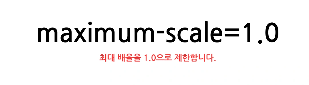
- maximum-scale=1.0: Limits the maximum magnification to 1.0. In other words, it makes it impossible to zoom in on the screen beyond 100%.
- minimum-scale=1.0: Limits the minimum magnification to 1.0.
If the maximum-scale attribute is set to a small value like 1.0, it completely restricts the user from zooming in or out of the screen. In such cases, a notification message "maximum-scale attribute is less than 5" is displayed, acting as a factor that lowers performance inspection scores, which can ultimately lead to a decrease in website traffic.
2. How to Fix 'maximum-scale' for SEO Performance Enhancement and Optimal VIEWPORT Settings
Solving the problem pointed out above is simple. You can just remove the incorrect settings and change to code that grants the user zoom permission. This small correction alone can prevent the drop in performance scores and significantly improve mobile accessibility.
Optimal VIEWPORT Setting Code
To solve the above problem, you can prevent the drop in performance scores by changing to the code below. This meta tag must be located between the head tags at the top of the HTML page, and you should delete and replace the existing restrictive code. The website operator must directly modify and apply this code to the template file.
meta name="viewport" content="width=device-width, initial-scale=1, shrink-to-fit=no"Explanation of the Modified VIEWPORT Setting Content
The modified code focuses on removing all unnecessary restrictions and ensuring that content is displayed well responsively on mobile devices.
- width=device-width: Sets the screen size equal to the screen width of the device (Device Width). This is a basic element of responsive web design that ensures content is rendered to fit the screen on all mobile devices.
- initial-scale=1: Sets the initial magnification to 1. It ensures the page is displayed at a 100% ratio when loading.
- shrink-to-fit=no: (Attribute used in some iOS versions) Disables automatic adjustment of the screen size to fit the content. This played a role in preventing the layout from breaking.
By changing it this way, users can freely zoom in and out of the screen, which immediately increases Web Accessibility and can also improve Google's performance inspection scores (Lighthouse, PageSpeed Insights). Also, it does not trigger the 'maximum-scale attribute is less than 5' error.
3. Mobile Accessibility and SEO: Long-term Impact of Zoom Restrictions
Beyond simply removing the error message, it is important to understand the long-term impact this issue has on SEO and User Experience (UX).
Web Accessibility and Legal Requirements
Google fully introduced Mobile-First Indexing in 2018, establishing mobile usability as a core indicator of SEO. Zooming restrictions can violate the Web Content Accessibility Guidelines (WCAG) 2.1 of the World Wide Web Consortium (W3C). WCAG specifies that content must be usable without loss of content or function when text is magnified to at least 200%. Therefore, zoom restrictions can lead to potential legal issues (especially for public institutions and large corporation websites) and SEO penalties.
Bounce Rate and Time on Page
If a user tries to zoom in to read small text on a screen but the function is restricted, the probability that the user feels great discomfort and immediately leaves the website increases. A high bounce rate acts as a negative signal to search engines that 'this page does not provide a satisfactory experience to users,' which accelerates the decline in search rankings. Conversely, free zooming increases the user's time on page, which has a positive impact on SEO.
Strategy for Securing Competitive Advantage: Responding to the Mobile-First Era
If competing websites have not yet resolved this issue or are using default themes as they are, you can secure a competitive advantage just by correctly modifying the VIEWPORT settings. Meeting the mobile usability indicators that Google continuously emphasizes becomes the core foundation for long-term SEO success.
In-depth Analysis of VIEWPORT Tags: target-densitydpi and minimum-scale
In the past, attributes like target-densitydpi were also used, but these are currently not supported or are ignored by most browsers. The minimum-scale attribute is also often set to 1.0 along with initial-scale, but since this also restricts the user's freedom of zooming, the safest and most recommended method, unless there is a special reason, is to remove the maximum-scale and user-scalable attributes and leave only initial-scale=1.
Mobile SEO Checklist (Additional Considerations Beyond VIEWPORT)
In addition to fixing VIEWPORT errors, the following items should be checked for mobile SEO optimization.
- Responsive Design: You should design so that the layout does not break and adjusts flexibly on all device sizes using CSS media queries, etc.
- Size of Clickable Elements: Elements that need to be touched, such as buttons or links, should be large enough so that users can press them without mistake (at least 48px x 48px recommended).
- Spacing between Elements: If clickable elements are placed too close, it causes mis-touches (mis-clicks). User experience should be improved by providing sufficient spacing.
- Page Speed Optimization: Loading speeds in the mobile environment should be maximized by improving Core Web Vitals (LCP, FID/INP, CLS) indicators.
- Avoid Use of Flash and Pop-ups: Obstructive elements that do not play in a mobile environment or cover the screen should be removed.
4. VIEWPORT Tag Setting Practice for SEO and Response Plans by Other Platforms
The process of applying this tag to an actual website or blog skin is relatively simple, but the modification location may differ by platform.
General HTML/PHP Based Websites
If you are in an environment where you can directly modify HTML files (index.html, header.php, etc.), find the existing meta name="viewport" ... code between the head and /head tags, delete it, and replace it with optimized code. Backing up is essential.
Tistory and Other Blog Platforms
In the case of Tistory, you must access the HTML editor from the 'Skin Edit' menu of the administrator page and modify the code within the head section. Since many Tistory skins basically include zoom restriction code, it is important to change that code to the optimized code suggested above.
You must check the changes in a mobile environment as well and inspect whether other layout elements are broken. Especially even if you use a responsive skin, mobile performance scores can drop if viewport settings are wrong.
Meaning and Permissible Range of VIEWPORT Attribute Values
Google recommends that the maximum-scale attribute be at least 5.0 or higher, or not exist at all. 5.0 means that the user can zoom in on the screen up to 500%, which meets most accessibility requirements. However, the cleanest and most recommended method is to completely remove the maximum-scale and user-scalable attributes and leave it to the browser's default behavior.
Search Engine Optimization is no longer a technique to deceive search engines, but a task to create a website that provides the best experience to users. Fixing the 'maximum-scale attribute is less than 5' error is the most basic technical step for user-centered SEO, and by resolving this error, a website can secure higher accessibility scores, improved performance, and long-term search ranking stability. Mobile SEO continues to evolve, and meticulously checking technical elements is the key to successful website operation.
What exactly does the maximum-scale attribute error mean and how does it affect SEO?
This error means that the maximum-scale attribute in the HTML VIEWPORT meta tag is set to less than 5.0, or user-scalable=no is set, restricting the user's screen zoom function. This hinders mobile accessibility, which is considered a violation of Google's quality guidelines. Consequently, it negatively affects Lighthouse performance scores and mobile SEO rankings.
What is the optimal VIEWPORT meta tag code to resolve the error?
The code to resolve the error and optimize mobile accessibility is as follows: meta name="viewport" content="width=device-width, initial-scale=1" This code allows users to freely zoom in by removing unnecessary user-scalable=no or maximum-scale attributes.
Is there anything that must be checked after modifying the VIEWPORT setting?
After modifying the VIEWPORT setting, you must check whether 'Accessibility' and 'Performance' scores have improved using PageSpeed Insights or Lighthouse tools. Additionally, you should visually inspect whether screen zooming actually works normally on various mobile devices (iOS, Android). It is also important to check that the layout is not broken.
Which is more recommended: setting maximum-scale to 5.0 or removing it altogether?
The most recommended method is to remove the maximum-scale attribute altogether to follow the browser's default settings (most allow 500% zoom). It is good to keep the code concise without needing to specify 5.0. If removed, users can zoom up to 500% depending on device settings, ensuring the best accessibility.